-
USD
-
UAH
-
EUR
Tin Can
Alishan Jingsyuan 100g Tin Can
2265,00 ₴Alishan Oolong 100g|Tin Can
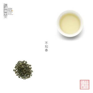
2394,00 ₴Bu Zhi Chun 100g Tin Can
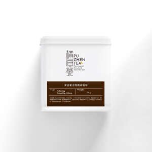
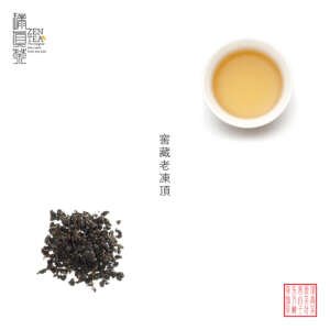
1878,00 ₴Cellaring Dongding Oolong 75g|Tin Can
3166,00 ₴Cellaring Tie Guan Yin 75g|Tin Can
2651,00 ₴Chiran Sencha 100g|Japanese Tea|Tin Can
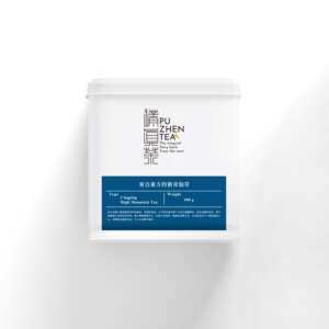
2102,00 ₴Cingjing High Mountain Tea 100g Tin Can
2981,00 ₴Diao Qiao Tou High Mountain Tea 100g
2921,00 ₴Divine Lishan Oolong 100g|Tin Can
3810,00 ₴Genmai Sencha 50g|Japanese Tea|Tin Can
1878,00 ₴Gui Fei Oolong 100g|Tin Can
2265,00 ₴Puzhen Tea Tin Can
The transformation and vitality of Puzhen Tea began after more than a year of operation in 2009. It became evident that the existing design, from CI identification to product packaging and promotional materials, needed a complete overhaul to break through existing difficulties. However, “cash is king,” and without money, even great ideas cannot be implemented. Later, by chance, an opportunity arose to set up a takeaway tea booth at the Horticultural Expo. This takeaway booth not only brewed tea every day but also infused a new vitality into the transformation of Puzhen Tea.
Brand Transformation: During the six months at the Horticultural Expo, there was some extra funding available, allowing for the brand`s transformation. However, the question arose: who should undertake this revitalization project? At this moment, we encountered a designer with ten years of experience: Huang Yifan. Despite his long-standing position in a professional design company, he decided to start taking independent projects, and Puzhen Tea became his first client. We hit it off right from the first meeting, so we entrusted him with the brand transformation project with great confidence. If the designs of Puzhen Tea have garnered some attention in the market over the years, Mr. Huang is the main reason for it.
The first step was to begin the transformation of the logo. Among ten proposals, one design stood out: using Puzhen Tea as the logo. This choice was made for two reasons. Firstly, the brand name is closely associated with “tea,” and we wanted to strengthen the connection between these three characters and tea in the minds of consumers. Secondly, as tea originated from ancient China, we hoped to emphasize the civilization`s acceptance of tea being spread from ancient China. Chinese characters are the most prominent feature in this regard.
After observing and comparing customers` reactions for over a year between the standard tin cans and white paper boxes, most customers felt that the tin cans had more weight, better texture, and a higher sense of value compared to the paper boxes. With this experience in mind, we decided to use tin cans as the primary packaging going forward.
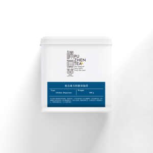
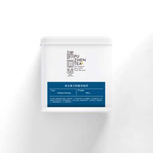
The design of the tin cans was inspired by the concept of portable bottles. While presenting aesthetic appeal wasn`t difficult, the key challenge was to establish a connection between the tin cans and Puzhen Tea. We categorized all oriental teas into four series based on flavor profiles and used four colors to symbolize these profiles, which were then applied as stickers encircling the tin cans. Additionally, to further reinforce the connection between Puzhen Tea and tea, we incorporated repeated patterns of tea leaves and the Chinese character for “tea.” Thus, the classic tin cans were born.
Since a minimum of 10,000 tin cans is produced at a time, to avoid excess inventory and enhance their utility, we not only used them for packaging loose tea leaves but also simultaneously developed tea bag products to cater to a broader audience.
In addition to being visually appealing, products must also address the challenges faced by the brand. The creation of the classic tin cans simultaneously resolved several issues encountered at that time:
From the perspective of brand development requirements: The design inspiration derived from the core product of portable bottles ensured a seamless connection with the brand. This made it easier to carry out brand transformations and develop new products without seeming too abrupt. Through the incorporation of the “tea character” and “tea pattern,” in addition to the logo, the connection between Puzhen Tea and tea was further strengthened.
Color is a crucial element in Puzhen Tea`s product design. From the perspective of customer experience: First, the colors symbolize the four series` flavor profiles, simplifying the purchasing process for customers. Essentially, customers who prefer fruity or honeyed flavors are likely to intuitively gravitate towards the pink tin cans. Second, the grand, stable yet slightly innovative style satisfies both personal use and gifting needs. Therefore, the classic tin can series is the best-selling product line, aptly named “classic” due to its enduring popularity.
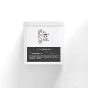
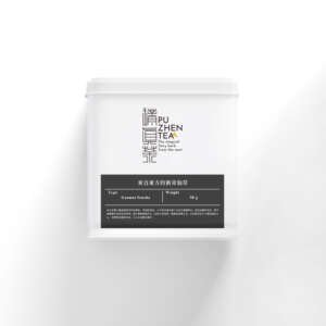
Puzhen Tea Tin Can made its grand debut in 2018 with matte black iron cans, featuring sleek and modern lines, exuding a sense of stability and practicality. Carrying unbrewed tea leaves, the Puzhen Tea tin can forms a perfect contrast with the classic tea soup inside the portable bottle. Drawing inspiration from this, we inverted the black-and-white ratio of the portable bottle, consistently embodying the brand`s philosophy and designing exceptional quality products. Carefully selected materials and thoughtful design ensure both tactile satisfaction and practicality. With a wide variety of tin cans available on the market, Puzhen Tea opted for iron material known for its preservative and sealing properties, providing a slight flexibility and comfortable weight, conveying a sense of substance. Moreover, the thoughtful design of the inner lid`s air hole facilitates easy opening and storage.
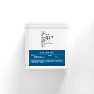
We utilize colors to symbolize the base tones of tea leaves, optimizing the customer`s purchasing process. Puzhen Tea categorizes Oriental tea leaves into five basic series, each represented by a color: Fragrant Series (Blue), Mellow Series (Green), Special Series (Pink), Cellaring Series (Brown), and Special Offering (Red). Through the visual presentation of colors, we make your selection more intuitive. Let the five colors guide you, leading you to intuitively find the magical Oriental herbal tea that suits your preferences.

